Vikings Tweak Logo

A.E

Vottomatic
Hall of Fame
Joined
Mar 31, 2007
Messages
14,335
Reaction score
132

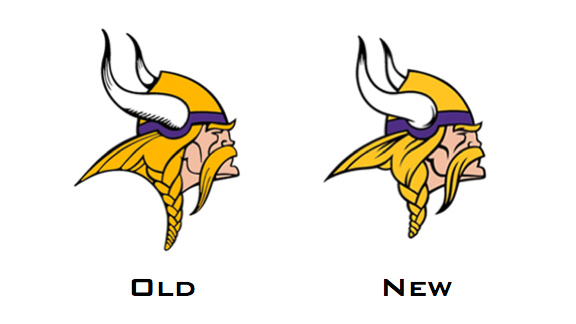
I don't know why but I don't like it. I hate when teams make any changes to logos they've had forever. This new Viking looks older and more rugged but I will say the colors aren't as vibrant. This is good news as the Vikings have been rumored to be ditching these wretched uniforms and going back a more classic look. Duller colors on this updated logo would indicate as much. We'll see come draft time.
 

Hurricane Season

Well-Known Member
Hall of Fame
Joined
Feb 15, 2009
Messages
27,130
Reaction score
1,228
The lines are slightly bolder, it got a haircut, and the horn matches the one on the helmets.

There isn't enough of a change to get upset about, IMO. I'd disagree on the colors as well. The yellow does look a tad brighter.
 

Rice18

I'm emotionally vested in me.
Joined
Feb 15, 2010
Messages
7,142
Reaction score
473
I like the change... Like Hurricane said, there is barely any change, so no need to even get upset.
 

buzzy

Well-Known Member
Hall of Fame
Joined
Oct 28, 2010
Messages
20,671
Reaction score
1,172
Outrageous.
 

A.E

Vottomatic
Hall of Fame
Joined
Mar 31, 2007
Messages
14,335
Reaction score
132
Butthurting b/c the changes are so minor that I don't see the point. I now have countless items that are obsolete and as somebody with borderline OCD, this bothers the hell out of me.

I think I'm done purchasing outrageously inflated NFL products though. Well...at least until that shit ends up on clearance. I picked up a Chiefs Nike Dri-fit at Hibbett for $8 the other day. That's a $34.99 shirt when it first hit the market.
 

Users Who Are Viewing This Thread (Users: 0, Guests: 1)

Who Wins Game 5?

  • Tampa Bay Rays (Away)

    Votes: 5 33.3%
  • Houston Astros (Home)

    Votes: 10 66.7%
Top