michael

Pugz

#ForPaul
Hall of Fame
Joined
Jun 17, 2007
Messages
127,713
Reaction score
2,100
love the colors, and overall design, render quality is poor, but that's a given.
 

ambivalentSoul

Active Member
Joined
May 23, 2013
Messages
949
Reaction score
124
Papa Pugzo said:
love the colors, and overall design, render quality is poor, but that's a given.
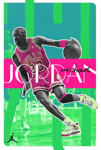
Thanks. It might be something I did to it though. Does this look better? Also changed the michael font bc I decided I didn't like it.
 

Pugz

#ForPaul
Hall of Fame
Joined
Jun 17, 2007
Messages
127,713
Reaction score
2,100
yea the render looks better now, face area still looks a bit lq. my quality is subjective since im on mobile, though.
 

mvxxie

New Member
Joined
Oct 10, 2013
Messages
31
Reaction score
3
thats tight, I dont like both fonts used though
 

ambivalentSoul

Active Member
Joined
May 23, 2013
Messages
949
Reaction score
124
mvxxie said:
thats tight, I dont like both fonts used though
Yea they're weird but I like em. This has kind of an 80's style and I think those fonts fit that.
 

Users Who Are Viewing This Thread (Users: 0, Guests: 1)

Who Wins Game 5?

  • Tampa Bay Rays (Away)

    Votes: 5 33.3%
  • Houston Astros (Home)

    Votes: 10 66.7%
Top