Instagram

ambivalentSoul

Active Member
Joined
May 23, 2013
Messages
949
Reaction score
124
So what do you guys think of the new Instagram logo? Is it better/worse?


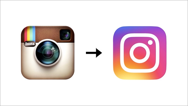
I like the thinking to simplify but they could have achieved what they set out to do while maintaining integrity from the original brand. Here's my shot at doing that. Let me know what you think!


bosoxlover12

We're Onto Cincinnati
ADMIN
Joined
Aug 16, 2010
Messages
36,768
Reaction score
1,153
It's better and worse at the same time

Idk how that logo would appear in a b/w medium, with the red being as dark as it is

I like the grey though. And I don't like the actual logo -- this is definitely more visually appealing but I'm not sure it works as well in bw
 

ambivalentSoul

Active Member
Joined
May 23, 2013
Messages
949
Reaction score
124
bosoxlover12 said:
It's better and worse at the same time

Idk how that logo would appear in a b/w medium, with the red being as dark as it is

I like the grey though. And I don't like the actual logo -- this is definitely more visually appealing but I'm not sure it works as well in bw
Sorry, I think my post may have been confusing. I added Instagrams old/new logo at the top. The one at the bottom is my shot at refreshing it.
 

bosoxlover12

We're Onto Cincinnati
ADMIN
Joined
Aug 16, 2010
Messages
36,768
Reaction score
1,153
I knew exactly what you meant pre-edit lol
 

bosoxlover12

We're Onto Cincinnati
ADMIN
Joined
Aug 16, 2010
Messages
36,768
Reaction score
1,153
the new logo works in a b/w medium, which was the intent of the designer, due to the minimalist trend. you can make it a silhouette and you'd still get the logo.
 
Yours is not as simple like that -- thats what im saying
 

ambivalentSoul

Active Member
Joined
May 23, 2013
Messages
949
Reaction score
124
Ahh ok good! I just realized afterward that some may not have seen the new logo yet and thought my design was the new one.

I agree their new logo is visually appealing, but it does little to separate itself from other generic camera apps. Simple design can be the most effective approach when done right. The challenge with simplicity becomes maintaining uniqueness. The simpler you go, the more likely you are to resemble something else and lose autonomy. It's a fine line to balance. I think Instagram lost some of that balance with their new logo. The problem is minimalist design has been the trend for a few years, so there's thousands of other apps and brands that now have a similar look and feel to Instagram. Visual appeal is important, but having a unique brand is always paramount. Other wise no one will recognize you.

As for working in a solid color: you're right, but their new logo actually lends itself better to that. They could just use the camera shape they created for the icon you see on your notification bar. Whereas the old logo, they had the create an icon that kind of resembles the logo. Tbh that was never really an issue, anyway, but that's one thing that he new logo does better.
 
For my design, something like this could easily work as the solid color icon:


Pugz

#ForPaul
Hall of Fame
Joined
Jun 17, 2007
Messages
127,713
Reaction score
2,100
thats good haha
 

pistonsboi

New Member
Joined
Apr 22, 2007
Messages
761
Reaction score
97
it's loud and obnoxious, I had to put the app inside a folder so I dont have to look at it

it could be half as shitty if they just flipped the color (which someone has already done, and a bunch similar to this)

i do like the interface more now, the app icon is booteeh
 

Users Who Are Viewing This Thread (Users: 0, Guests: 1)

Who Wins Game 5?

  • Tampa Bay Rays (Away)

    Votes: 5 33.3%
  • Houston Astros (Home)

    Votes: 10 66.7%
Top