Jets unveil new jersey!

Status
Not open for further replies.

germany00

Preds 2013?
Joined
Jan 6, 2011
Messages
2,948
Reaction score
48

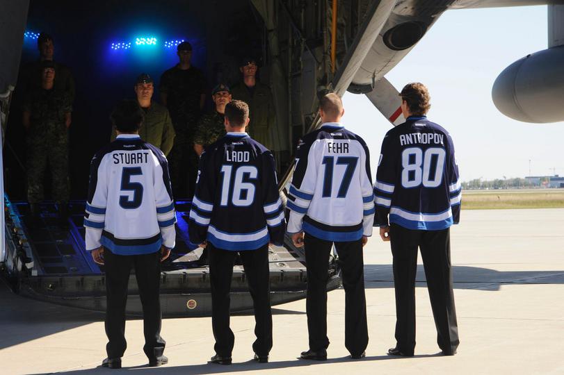
True North Sports & Entertainment today proudly unveiled their dark home and white away jerseys for the Winnipeg Jets Hockey Club at a ceremony held at 17 Wing in Winnipeg in front of a Dash 8, CF-18, and Hercules airplanes. The Jets will begin play in the National Hockey League in 2011-12 when they open up against the Montreal Canadiens on Sunday, Oct. 9th at 4:00 p.m. at MTS Centre.

The jerseys consist largely of two shades of blue. The primary navy blue base of the home dark jerseys is referred to as "Polar Night Blue" which is found on many of today's Royal Canadian Air Force planes, including the Dash 8. The lighter, secondary blue is called "Aviator Blue" which is similar to the historical colours by used the RCAF, including traditional RCAF flags and the jerseys of the 1948 RCAF Flyers. The jersey also features the previously unveiled primary logo on the front, with the secondary logo placed on the shoulders of each jersey.

"We wanted to create a look that worked well with Reebok's modern and innovative "Edge System" uniforms," said Kevin Cheveldayoff, Executive Vice-President & General Manager of the Winnipeg Jets. "However, it was also vitally important to us to honour the rich history of hockey in our city, and fit the era of the Royal Canadian Air Force which inspired the primary crest design. The result is clean, simple and traditional."
 

.infamous

Well-Known Member
Hall of Fame
Joined
Sep 25, 2009
Messages
25,700
Reaction score
771
kinda what I thought they would look like actually lol
 

.infamous

Well-Known Member
Hall of Fame
Joined
Sep 25, 2009
Messages
25,700
Reaction score
771
Look so much like columbus'
yea I thats what I thought when I seen the pic lol. Alot of teams are following that kinda of jersey now. I wasn't gonna be surprised when I saw the logo cause I thought it would fit with that type of jersey actually.
 

germany00

Preds 2013?
Joined
Jan 6, 2011
Messages
2,948
Reaction score
48
They still look pretty cool though :p
 

TTN2810

New Member
Joined
Jan 3, 2009
Messages
10,522
Reaction score
211
LMAO. The "fakes" looked exactly like that, and the team said they were "not even close". That's bullshit. So ugly.

EDIT

Here's the fake. It's actually nicer lol.


germany00

Preds 2013?
Joined
Jan 6, 2011
Messages
2,948
Reaction score
48
lol the only difference is that the real ones have more teal on the elbows and waist lol
 

TTN2810

New Member
Joined
Jan 3, 2009
Messages
10,522
Reaction score
211
I really like the number/name font, and with other angles, the white jerseys are nice. The blue ones are horrible though.
 

Mr.Baller

Well-Known Member
Joined
Dec 28, 2009
Messages
6,438
Reaction score
158
Not liking it .. they should take the old one back .
 

playmaker7

The GOAT
Hall of Fame
Joined
Feb 18, 2006
Messages
53,162
Reaction score
226
Yeah they look like the Jackets and just didn't do anything new with it. Kinda boring to me, but we'll see when they get on ice.

They really should have used the old one
 

Rios15

Well-Known Member
Hall of Fame
Joined
Jul 3, 2008
Messages
21,759
Reaction score
256
I'll have to see them on the ice but right now they look boring and plain.
 
Status
Not open for further replies.

Users Who Are Viewing This Thread (Users: 0, Guests: 1)

Who Wins Game 5?

  • Tampa Bay Rays (Away)

    Votes: 5 33.3%
  • Houston Astros (Home)

    Votes: 10 66.7%
Top